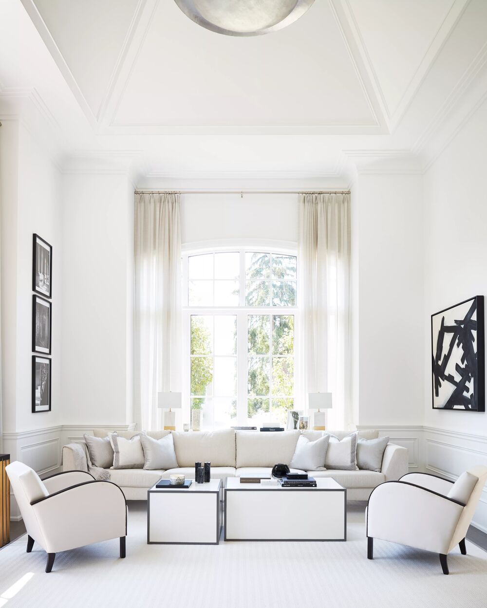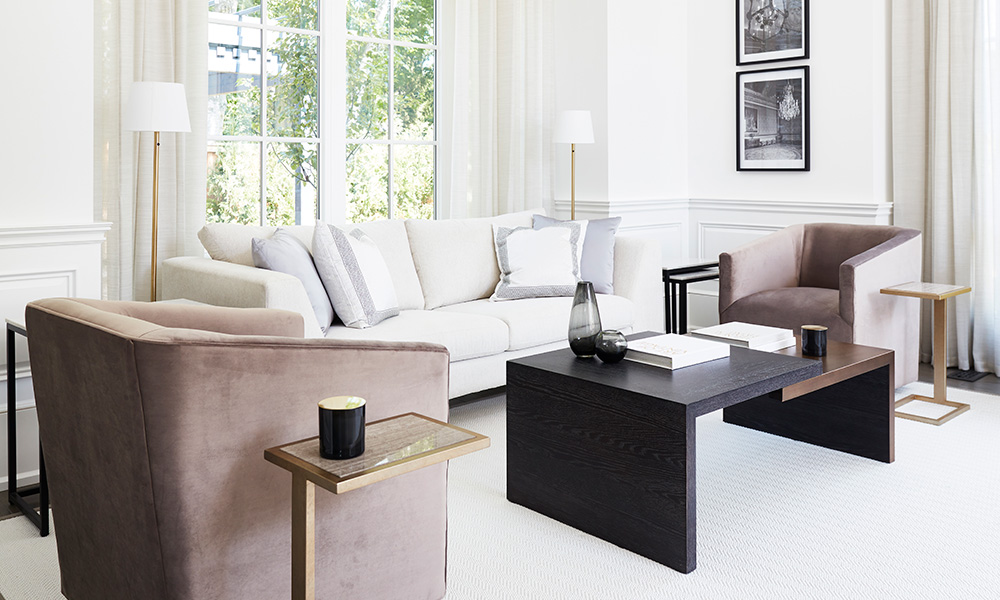
A monochromatic room is timeless, calming, and effortlessly stylish. By focusing on a single hue, you can create a space that feels cohesive and thoughtfully designed. Yet while this look appears simple, getting it right requires a bit of nuance. The key is to balance tone, texture, and light so the room feels rich, not flat. Here’s how to design a monochromatic room that feels anything but one-note.
1. Mix Textures for Depth
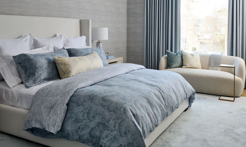
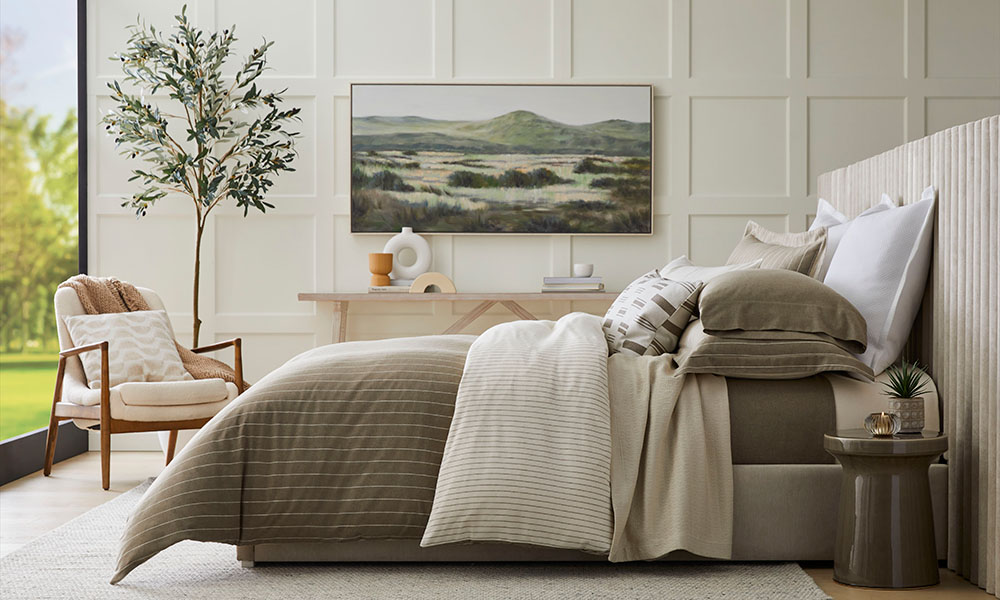
When working with one main colour, texture becomes your best tool for visual interest. Layer materials that contrast in sheen and feel—matte paint, plush fabrics, smooth metals, and soft weaves—to add depth to the palette. For instance, pair a textured-look wallpaper with a linen-upholstered headboard and a ceramic table lamp. This variation keeps a monochromatic room dynamic while maintaining its serene, tonal harmony.
2. Play With Shades from Light to Dark
Even within a single colour family, a range of tones makes a big difference. Combine lighter and darker variations of your chosen hue to bring sophistication and flow to the space. For example, in a soft grey living room, paint the walls in a mid-tone, introduce a pale rug underfoot, and choose darker drapery to frame the windows. This light-to-dark gradient adds dimension while preserving the calm continuity that defines a monochromatic room.
3. Layer Lighting for Warmth
Lighting has the power to enhance your palette and reveal subtle differences in shade and texture. Incorporate layers of ambient, task, and accent lighting throughout the space. A mix of wall sconces, floor lamps, and overhead fixtures creates both function and atmosphere. Choose warm, diffused light sources that cast a soft glow and highlight the layered tones of your monochromatic room beautifully.
4. Ground the Look with an Area Rug
A well-chosen rug not only anchors your furniture but also reinforces the room’s colour story. For a monochromatic design, select a rug that complements your palette without perfectly matching it. A tonal variation—like a slightly deeper shade of taupe or a subtle geometric weave—will bring definition and texture underfoot. Be sure the rug extends far enough beyond your seating or bed to visually expand the room.
By embracing texture, tonal variation, thoughtful lighting, and layered materials, a monochromatic room becomes anything but plain. It’s a design approach that feels polished and soothing—perfect for creating a home that stands the test of time.
For more tips on designing a monochromatic space, watch this Cityline segment with Brian Gluckstein where he breaks down common designer terms.
Photography by Angus Fergusson


