Design mistakes happen to all of us. In fact, much of creating a home you truly love comes from the trial and error of figuring out what doesn’t work. But knowing a few of the most common missteps can help you avoid frustration—and move more quickly toward a space that feels polished, personal, and comfortable.
Here are five design mistakes we often see, along with simple ways to solve them.
1. Thinking everything has to match
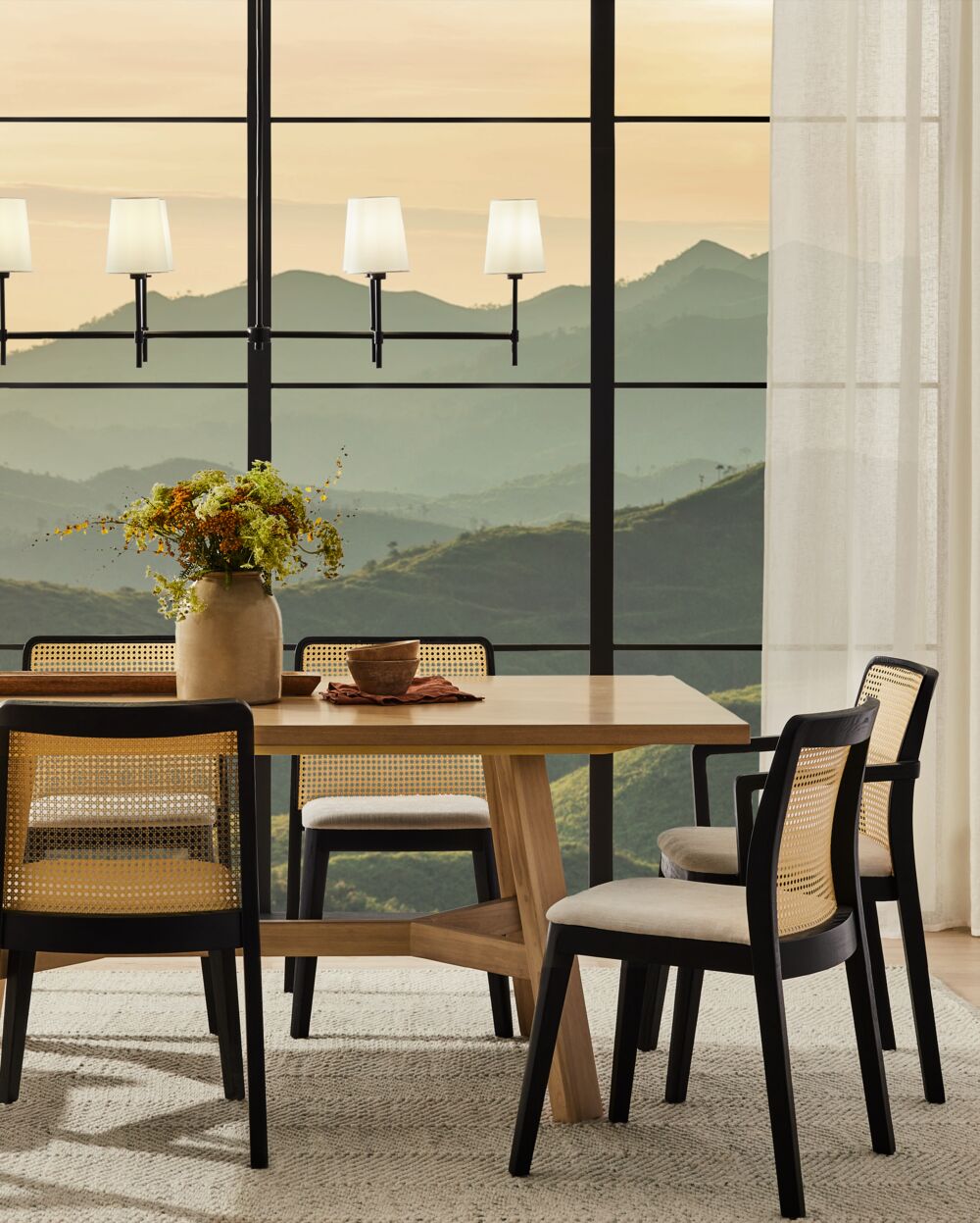
Matching every piece of furniture or decor might sound safe, but the result often feels flat and impersonal. Instead, look to combine styles you love. Pair a modern sofa with a vintage coffee table, or layer a traditional area rug under contemporary furniture. Mixing different materials, finishes, and even eras will add depth and character.
The key is balance. Choose one overall style to ground the room, then bring in accents from other looks for contrast and personality. For example, a clean-lined space can instantly feel warmer with the addition of textured drapery or an antique-inspired mirror.
2. Having only one light source
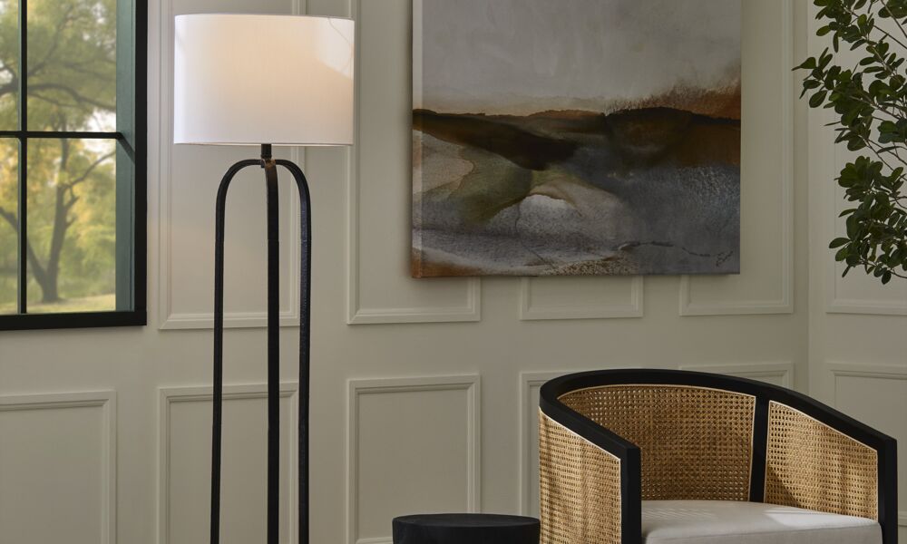
Relying on a single overhead fixture is one of the most common design mistakes—and one of the easiest to fix. The best rooms layer ambient, accent, and task lighting for a glow that’s both practical and atmospheric.
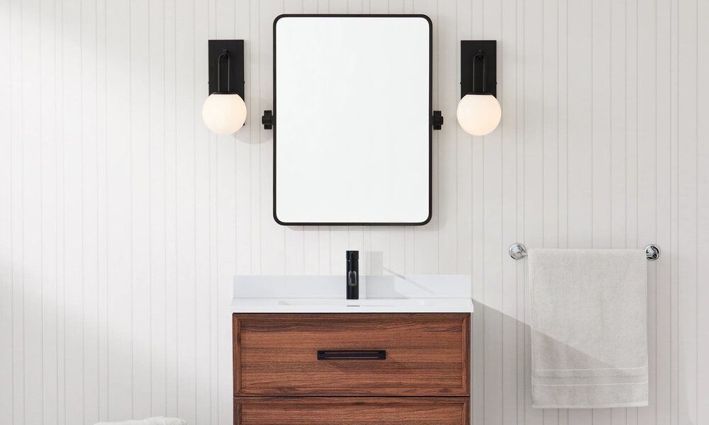
Think of overhead pendants or pot lights for overall illumination, wall sconces to highlight artwork or wallpaper, and table or floor lamps for reading or working. Even in small rooms, having at least two or three light sources at different heights creates dimension and makes the space far more inviting.
3. Not measuring your space
Skipping the measuring tape is a recipe for stress. Beyond the obvious wall and ceiling dimensions, remember to measure doorways, hallways, and staircases to ensure your new sofa or dining table will actually make it into the room.
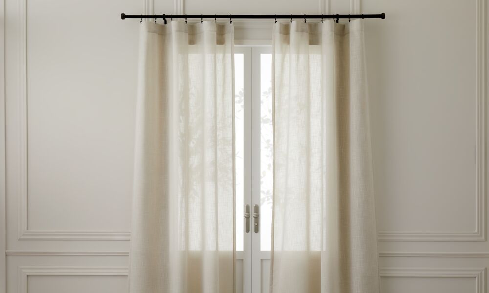
Keep your measurements handy so you can double check before placing any orders. This extra step prevents costly mistakes and also helps you plan details like how a patterned area rug will fit beneath your seating group or how much drapery fabric you’ll need for full coverage.
4. Choosing aesthetics over comfort
Beautiful furniture is tempting, but looks alone won’t make your home enjoyable to live in. Prioritize comfort just as much as style. An eye-catching chair that no one wants to sit in will quickly become wasted space.
Consider your lifestyle, too. Families with kids or pets may prefer forgiving fabrics and sturdy wood finishes over glass or mirrored surfaces that demand constant maintenance. If you love a tailored look, opt for performance fabrics or upholstered pieces with removable covers—both can give you the aesthetic you want without sacrificing practicality.
5. Ignoring traffic flow
How people move through a room is as important as how it looks. One of the easiest design mistakes to make is forgetting about clear walkways. Allow at least 18 inches between furniture pieces to avoid bumps and awkward navigation.
Also consider how furniture placement affects flow. A sofa with its back blocking an entry point can feel uninviting, while a strategically placed console table or area rug can guide the eye and subtly define zones in an open-concept space.
Design mistakes aren’t failures—they’re simply opportunities to learn what works better. With a few thoughtful choices, from layered lighting to balanced layouts, you can sidestep the most common pitfalls and create a home that feels harmonious and lived-in.
Photography by A Plus Creative


