
Colour never looks the same all day long. It shifts as the light changes—sometimes subtly, sometimes in ways that are hard to ignore. That’s why choosing paint can feel uncertain. A colour that looks perfect in the store may feel cooler, darker, or warmer once it’s on your walls. The key is understanding how light affects colour in your home. When you know what to look for, you can make smarter choices and avoid common surprises—especially when you’re figuring out how to choose paint colours that will work throughout the day. This guide breaks down how light and undertones affect colour, so your final choice feels right from morning through evening.
Why Lighting Changes Everything
A paint swatch shows you a colour at one moment. Your home shows it many times over the course of a day. Natural light, artificial lighting, and nearby finishes all affect how colour looks once it’s on the wall.
Morning light is usually cooler and softer. It can make whites look crisper and cooler tones feel more pronounced. Midday light is often the most neutral, which is when colours tend to look closest to their true shade. In the evening, light becomes warmer and lower, bringing warmth to neutral colours while making cooler shades appear softer or slightly muted.
Before choosing a paint colour, pay attention to how the room feels at different times of day. Is it bright early on but dim by afternoon? Does it rely more heavily on lamps in the evening? These patterns matter more than how a colour looks at a single moment.
How Climate and Season Affect Colour
Where you live also plays a role in how colour behaves. In northern climates, lower sun angles and frequent cloud cover can make rooms feel cooler and flatter. Warm neutrals and earthy tones often help bring balance and warmth to these spaces year-round.
In sunnier regions, strong daylight can wash out very pale colours. Mid-tone shades tend to hold their depth better and feel more stable throughout the day. Seasonal changes affect colour as well. Summer light can make whites feel sharper and brighter, while winter light often makes colours appear deeper and more enveloping. A paint colour that feels balanced across seasons is one that responds well to these shifts rather than fighting them.
Choose Colours That Work With Your Light
Instead of trying to change a room’s natural conditions, it’s easier to work with what’s already there. Cooler rooms usually feel better with colours that add warmth. Brighter rooms can handle slightly cooler or deeper shades without feeling cold.
Undertones play a major role here. In rooms with cool or limited natural light, warmer undertones—such as creamy whites, soft taupes, or muted terracotta—help prevent the space from feeling flat. Rooms filled with warm sunlight often feel more balanced with cooler undertones, like soft blues, pale greens, or deeper greys.
Testing paint properly makes a big difference. Paint a large sample on more than one wall and live with it for a few days. Look at it in the morning, in the afternoon, and at night. Turn the lights on and off. Open and close the curtains. This step can clarify how to choose paint colours that feel consistent and intentional over time. Testing paint generously also helps when you’re learning how to choose paint colours that will behave well in real life.
Using Lighting and Furnishings to Create Balance
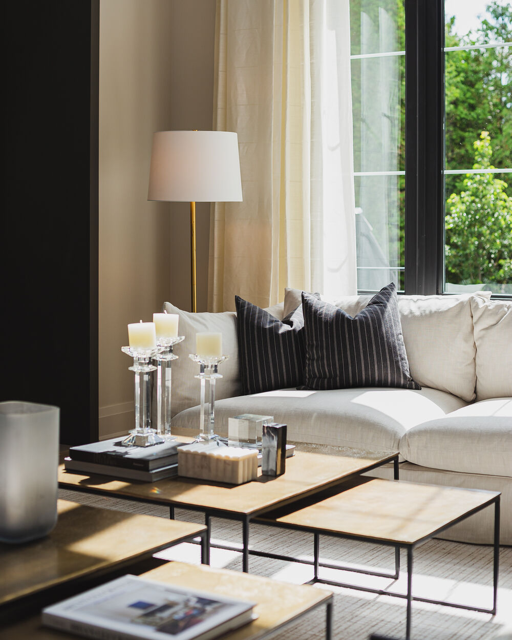
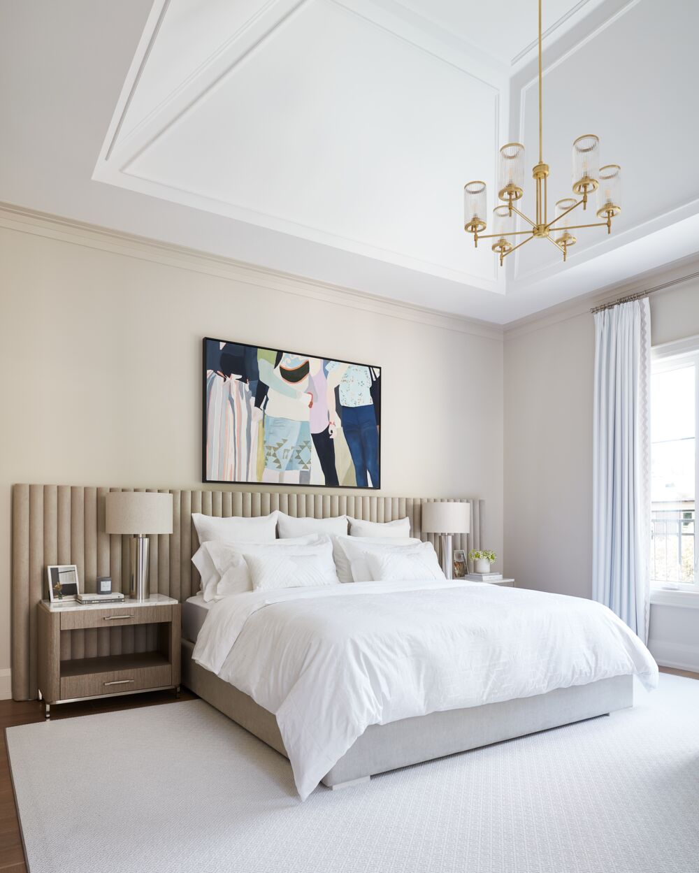
If a paint colour still shifts more than you’d like, the surrounding elements can help correct it. Interior lighting is one of the most effective tools. Warm bulbs add softness and can balance cool natural light. A layered lighting plan—using table lamps, floor lamps, pendants, and sconces—creates a more even, comfortable glow and reduces harsh shadows.
Furnishings also influence how colour reads. Area rugs, wood tones, upholstery, and artwork all interact with wall colour. A warm-toned rug can soften a cooler feeling space, while matte finishes help reduce glare and reflect light more gently.
Window treatments matter too. In rooms with strong sunlight, lined or heavier drapery can prevent colours from looking washed out. In spaces with limited light, sheers or simple Roman shades allow daylight in without making the room feel heavy.
Wallpaper can also help bridge colour shifts by adding pattern and tonal variation, especially in rooms where light changes dramatically throughout the day.
Rather than looking for a colour that stays exactly the same at every hour, aim for one that responds well to your home’s light. When you understand how light behaves in your space, how to choose paint colours becomes far more predictable. The result is a room that feels balanced, comfortable, and considered—no matter the time of day.
Photography by Britney Townsend (1), Angus Fergusson (2)
