
Choosing the best warm neutral paint colours can make a room feel softer, calmer, and more inviting without adding strong colour. Warm neutrals are especially useful because they create a versatile backdrop for furniture, art, lighting, and textiles. They can brighten a dark room, soften a modern space, or make a larger room feel more comfortable and layered.
The key is choosing a warm neutral that works with the light, finishes, and mood of the room. A shade that looks creamy and balanced in one space can feel yellow, pink, flat, or too dark in another. Before choosing a paint colour, consider the room’s natural light, the direction it faces, the materials already in the space, and how much contrast you want.
Here are some favourite warm neutral paint colours to try, along with practical tips for choosing the right one.
Start With the Room’s Light
Natural light has a major impact on how warm neutral paint colours appear. The same shade can look fresh in one room and muddy in another, so it helps to think about exposure before narrowing your options.
North-facing rooms usually receive cooler, softer light. A warm white, creamy beige, or greige can help balance that coolness and make the room feel more comfortable.
South-facing rooms often get warmer, brighter light throughout the day. These rooms can usually handle a wider range of warm neutrals, from soft white to deeper taupe.
East-facing rooms tend to feel brightest in the morning and cooler later in the day. A balanced warm neutral can help the room feel consistent from morning to evening.
West-facing rooms often become warmer and more golden in the afternoon. In these spaces, test carefully so the paint does not become too yellow or peachy later in the day.
Choose a Warm White for a Soft, Fresh Look
Warm white paint is a good choice when you want a room to feel bright but not stark. Unlike cooler whites, warm whites often have subtle cream, beige, or yellow undertones that make a space feel softer and more inviting.
Warm whites work especially well in living rooms, bedrooms, hallways, and open-concept spaces where one colour needs to flow easily from room to room. They also pair well with natural wood, woven textures, warm metals, linen drapery, and layered lighting.
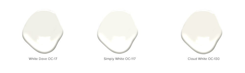
A few Benjamin Moore warm whites to consider:
OC-17 White Dove
A soft, versatile white that works well in many rooms. It has enough warmth to feel comfortable without looking overly creamy.
OC-117 Simply White
A brighter warm white that can make a room feel fresh and clean. It works well in spaces with good natural light.
OC-130 Cloud White
A classic warm white with a slightly creamier feel. It is useful for rooms where a pure white would feel too sharp.
Try Warm Grey for a Balanced Neutral
Warm grey is a useful choice when you want something more grounded than white but softer than a true grey. Look for greys with beige, taupe, or subtle brown undertones. These shades are often called greige, and they can be very versatile because they bridge warm and cool elements in a room.
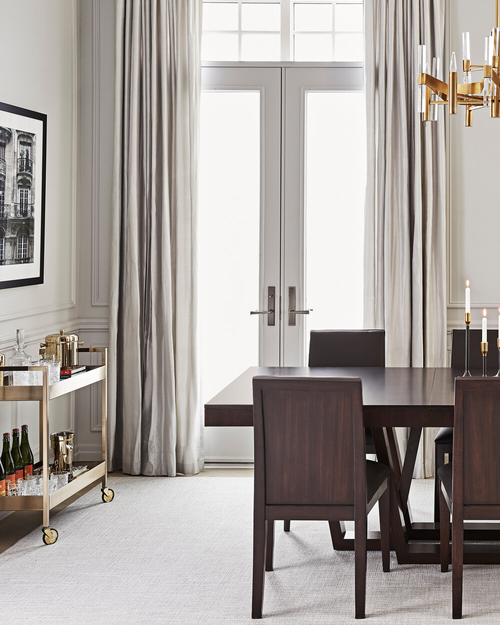
Warm greys work well in dining rooms, living rooms, home offices, and bedrooms. They can make a space feel calm and tailored, especially when paired with wood furniture, natural textiles, darker accents, and layered lighting.
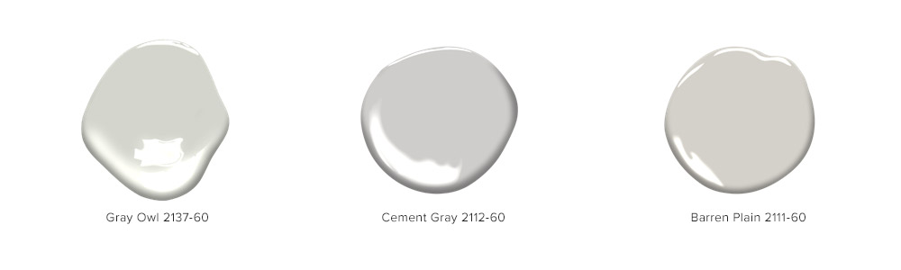
A few Benjamin Moore warm greys to consider:
2137-60 Gray Owl
A light, adaptable grey that can shift depending on the room. Test it carefully, especially in cooler spaces.
2112-60 Cement Gray
A soft grey with warmth that works well with natural materials and tonal decorating.
2111-60 Barren Plain
A quiet, versatile neutral that can create a calm backdrop without feeling too cool.
Consider Earthy Neutrals for More Depth
For a little more character, try warm neutrals with earthy undertones. These shades can still feel timeless, but they add more personality than a standard white or grey. Think soft beige, muted blush, clay, mushroom, taupe, sand, or warm stone.
Earthy neutrals work especially well in bedrooms, powder rooms, dining rooms, and spaces where you want a more enveloping feel. They also pair beautifully with woven textures, natural rugs, warm woods, brass accents, and soft upholstery.
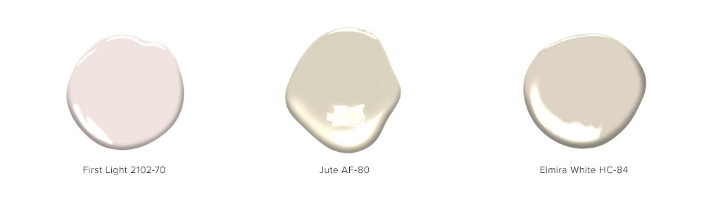
A few Benjamin Moore options to consider:
2102-70 First Light
A barely-there blush that can soften a bedroom, dressing area, or powder room without feeling overly pink.
AF-80 Jute
A warm, natural neutral that works well with woven textures, linen, wood, and relaxed interiors.
HC-84 Elmira White
A deeper, more complex neutral with warmth and depth. It can feel classic, comfortable, and quietly grounded.
Match the Paint Colour to the Room
A warm neutral should support the function and feeling of the room. Before choosing, think about how the space is used.
For a bedroom, choose a shade that feels restful and soft. Warm whites, pale greiges, and muted earthy neutrals can help create a calm retreat.
For a living room, look for a neutral that works well with upholstery, rugs, drapery, and lighting. A warm white or greige can create an easy backdrop for layered pieces.
For a dining room, consider a slightly deeper warm neutral. Taupe, warm grey, or muted beige can add atmosphere without making the room feel dark.
For a powder room, a warmer or more saturated neutral can feel more intentional. Small spaces are often a good place to try deeper taupe, clay, or blush-toned neutrals.
For a home office, choose a colour that feels comfortable over long periods of time. Warm grey, soft beige, or a balanced greige can feel focused without being too cool.
Check the Existing Finishes
Paint should work with the finishes that are already in the room. Flooring, tile, countertops, cabinetry, drapery, and upholstery can all change how a warm neutral looks.
Warm wood floors usually pair well with creamy whites, beige, taupe, and warm greys.
Cooler stone, grey tile, or black accents often need a more balanced warm neutral so the walls do not look too yellow.
Colourful art or patterned textiles may call for a simpler warm white or greige that gives those elements room to stand out.
Brass, bronze, and gold finishes often look especially natural with warm neutrals because the undertones help the room feel cohesive.
Test Paint Colours Before Comitting
Sampling is one of the most important steps when choosing warm neutral paint colours. Small paint chips are useful for narrowing options, but they do not show how the colour will behave across a full wall.
Paint large swatches on more than one wall, or use large peel-and-stick samples. Look at them in morning light, afternoon light, evening light, and with lamps turned on. If possible, test the colour near trim, flooring, upholstery, and window treatments.
A warm neutral should still look good in the least flattering light of the day. If it only works for a few hours, it may not be the right choice.
Tips for Choosing a Warm Neutral Paint Colour
Look at undertones
Warm neutrals often have hints of yellow, red, pink, beige, or brown. These undertones are what make the colour feel warm, but they can become stronger once painted on the wall.
Compare colours side by side
Testing two or three options together makes the undertones easier to see. One shade may suddenly look pink, green, or yellow beside another.
Consider contrast
A warm neutral room still needs definition. Add contrast through crisp trim, darker furniture, black accents, polished hardware, or deeper textiles.
Layer texture
Warm neutral paint colours feel richer when paired with tactile materials like linen drapery, woven shades, velvet cushions, wood furniture, or a tonal area rug.
Think long-term
The best warm neutral paint colours are flexible. They should work with different seasons, small decor updates, and changes in furniture or art over time.
A warm neutral paint colour is one of the simplest ways to make a home feel calm, comfortable, and timeless. Whether you choose a soft white, warm grey, greige, or earthier tone, the right shade should work with the room’s light, finishes, and everyday use. With careful testing and thoughtful layering, warm neutrals can create a beautiful backdrop that feels inviting year-round.
Photography by A Plus Creative
