White paint can look clean, soft, warm, bright, or quietly layered. It all depends on the undertone, the light, and the way it relates to everything else in the room. That is why choosing the best white paint colours is rarely as simple as picking the brightest swatch in the fan deck.
A good white should support the mood of the space. It can make a room feel fresh and modern, soften a traditional interior, or create a calm backdrop for art, furniture, and architectural details. The key is to look beyond the paint chip and consider how the colour will behave in your own home.
Start With the Undertone
Most white paint colours have an undertone, even when they appear very subtle at first. Some lean warm, with hints of cream, beige, yellow, or pink. Others feel cooler, with traces of grey, blue, or green.
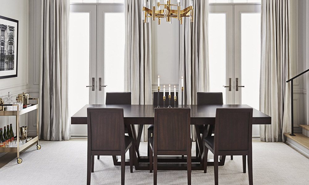
Warm whites, like Benjamin Moore Glacier White OC-37, tend to feel soft and inviting. They work especially well with natural materials, warm wood tones, linen upholstery, brass finishes, and palettes that include beige, taupe, chocolate, or camel. If your room already has warm flooring, warm stone, or cream-coloured fabrics, a slightly warm white will usually feel more harmonious than a sharp, cool white.
Cool whites, like Benjamin Moore Snow White 2122-70, feel cleaner and crisper. They pair well with grey upholstery, black accents, polished nickel, and contemporary furniture. In a room with charcoal, platinum, or blue-grey tones, a cool white can help the space feel fresh and tailored.
For something more balanced, Benjamin Moore Cloud White CC-40 is a soft, versatile option that sits comfortably between warm and cool. It can work well when you want a white that feels classic and easy to live with, especially in rooms that combine warm and cool elements, such as wood floors, grey upholstery, black accents, or mixed metal finishes.
The most common mistake is choosing a white that fights with the fixed finishes in the room. Before looking at paint, take note of the flooring, tile, countertops, fireplace stone, cabinetry, and large upholstery pieces. These are the elements the paint needs to live with every day.
Consider the Natural Light
Light changes everything. A white that looks soft in one room can feel stark in another, while a shade that appears warm in the store may look grey or flat at home.
North-facing rooms often receive cooler, indirect light. In these spaces, a warm white can help balance the natural grey cast and make the room feel more comfortable. A cool white may still work, but it can appear sharper and less forgiving, especially in winter or on overcast days.
South-facing rooms usually have warmer, brighter light for much of the day. These spaces can handle a cooler or more neutral white without feeling too cold. If the room gets strong sun, avoid whites that are overly bright or blue-toned, which can become harsh in intense daylight.
East-facing rooms tend to feel brighter and warmer in the morning, then cooler later in the day. A balanced white is often the safest choice, particularly in bedrooms and kitchens where the room is used at different times.
West-facing rooms can feel cooler in the morning and warmer later in the afternoon. If the space gets strong evening sun, test carefully to make sure the white does not turn too yellow or peach as the light shifts.
Match the White to the Room
The best white paint colours are not always the same from room to room. A living room, kitchen, bedroom, and hallway may each need something slightly different.
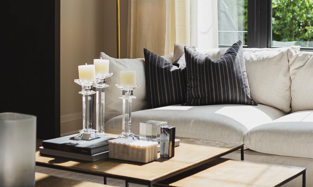
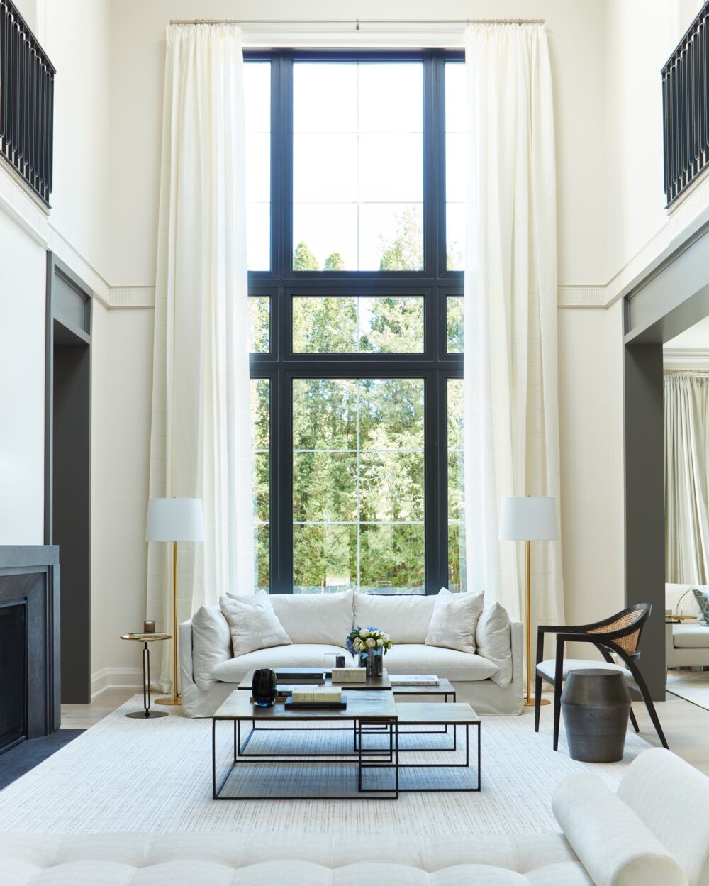
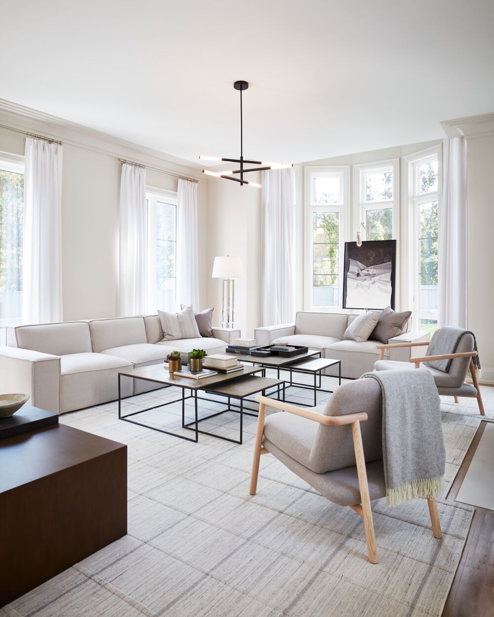
In a living room, white usually needs to work with upholstery, rugs, art, drapery, and wood tones. A soft warm white can make the space feel relaxed and layered, while a cleaner white can create a more contemporary backdrop for strong silhouettes or bold artwork.
In a kitchen, the cabinetry, countertops, backsplash, and appliances will guide the decision. A bright white can look crisp with marble, black accents, and polished metal. A creamier white may be better with warm stone, brass hardware, or wood cabinetry.
In a bedroom, white should feel restful rather than stark. Softer whites, warm whites, or whites with a gentle grey undertone often work well because they create a calm backdrop for bedding, drapery, and layered textures.
In hallways and entryways, white can help brighten spaces that do not receive much natural light. Choose a shade that connects well to the rooms around it. A hallway white should feel like a transition, not a sudden shift.
In bathrooms, pay close attention to tile and stone. A cool white can look fresh with grey or blue-based materials, while a warmer white will usually sit better with beige, cream, or travertine tones.
Look at the Whole Palette
White walls rarely stand alone. They are part of a larger palette that includes furniture, textiles, flooring, metals, and lighting. Before making a final choice, gather a few key materials from the room and look at them beside the paint sample.
If the fabrics are warm, textured, or natural, a slightly creamy white can feel more connected. If the room is built around black, grey, glass, or polished metal, a cleaner white may be a better fit. For a layered neutral room, consider an off-white or chalky white rather than a pure white. It will still feel light, but with more depth.
This is also where trim matters. White walls with white trim can look seamless and calm, but the two whites need to relate. For a cohesive effect, use the same white on the walls and trim in different finishes.
Test Before You Commit
Testing is the most important step when choosing the best white paint colours for your home. Paint chips are too small to show how a white will behave across a full wall, especially as the light changes through the day.
Start with three options. More than that can make the decision harder. Paint each colour on a large sample card or directly on the wall in a few different areas of the room. Look at the samples beside windows, in corners, near trim, and close to major furniture pieces.
Check them in morning light, midday light, evening light, and after the lamps are on. A white that looks fresh during the day may feel too cool at night. Another may look soft in the morning but too creamy in afternoon sun. The right choice should look good most of the time, not just in one perfect moment.
Pay Attention to Artificial Lighting
Paint colour does not stop changing when the sun goes down. Lamps, sconces, pendants, and recessed lighting all affect how white walls appear at night.
Warm bulbs can make creamy whites feel richer, but they can also push some shades too yellow. Cooler bulbs may make a clean white feel bright, but they can also make a room feel less comfortable. For most living spaces and bedrooms, soft, warm lighting is usually the most flattering.
Layered lighting also helps. Instead of relying on one overhead fixture, use a mix of table lamps, floor lamps, sconces, and dimmers. This creates softer pools of light and prevents white walls from feeling flat or stark.
Choose the Right Finish
The finish can change how a white paint colour looks and performs. Flat or matte finishes absorb light and can make walls feel soft and quiet. They are often a good choice for lower-traffic rooms, ceilings, and spaces where you want to minimize imperfections.
Eggshell is a practical option for many walls because it has a subtle sheen and is easier to clean than a flat finish. Satin works well for trim, doors, and moulding because it has more durability and reflects a bit more light. High gloss can be striking on trim or ceilings, but it will highlight every surface detail, so it works best when the preparation is excellent.
For a seamless look, consider using the same white throughout the room and changing only the finish. Walls might be eggshell, trim satin, and the ceiling flat. The result feels cohesive, but still has enough variation to give the architecture definition.
White paint may seem like a small decision, but it has a major effect on how a room feels. By looking closely at undertones, natural light, artificial lighting, finishes, and the existing materials in your home, you can choose the best white paint colours with more confidence and create a space that feels bright, comfortable, and thoughtfully pulled together.
Photography Angus Fergusson