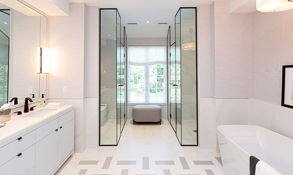
The all-white colour palette has stood the test of time in bathroom design. And there’s certainly no question as to why. It makes a smaller room feel larger, invokes a fresh spa-like feeling, and provides the perfect backdrop to add personality with accessories and towels. While it may seem impossible to reinvent the classic all-white look, this principal ensuite, designed by Brian Gluckstein, is total bathroom goals. Find out how he elevated the all-white bathroom with clever hits of black and thoughtful design elements.
Patterned Flooring
A large scale basket weave pattern in the ensuite gives this room a fresh and modern feel. This graphic design could easily overpower the space, so Brian selected two shades on the subtle side to keep the look soft and sophisticated.
Brian’s Tip: To recreate this look, cut 12×12 tiles into three equal strips. It’s an easy custom upgrade for any renovation project.
A Bit of Black
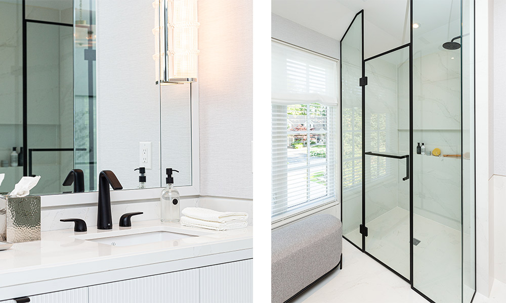
Just like jewelry can make an outfit, the same can be said for bathroom hardware and fixtures. The matte black faucet used here pops against the white background, allowing the sleek curves of the fixtures to be the star. Brian carried the same black finish to the frame of the glass panel door on the shower. It adds the perfect dose of drama. Black accents might feel like a big risk in the bathroom, but it’s a trend with classic roots. It’s surely a design choice that will stand the test of time.
Fluted Details
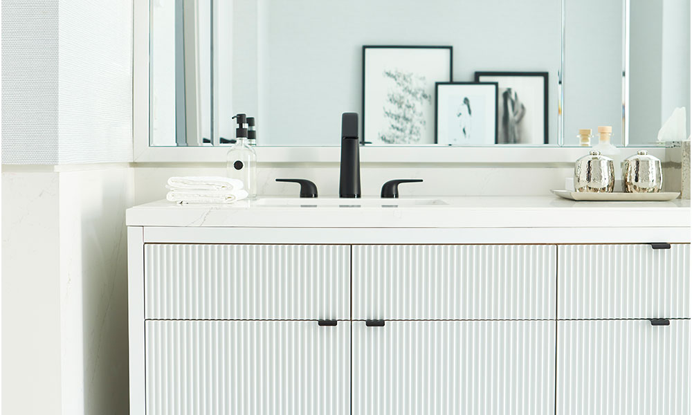
To give the vanity drawer fronts and doors a little something extra in this white bathroom, Brian designed the cabinetry with reeded panels. The fluted detail runs edge-to-edge to modernize the more traditional design. The slim hardware maximizes the effect of the texture.
Wow Walls
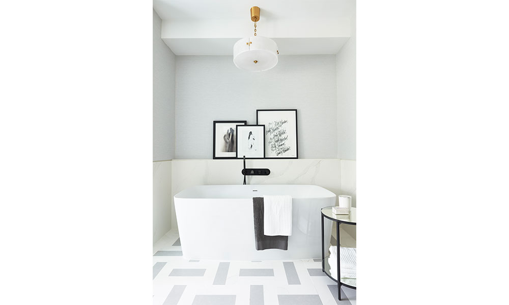
More commonly used in dining rooms and hallways, wainscoting is an unexpected – and practical – wall treatment in a bathroom. Here, full slabs of creamy composite stone surround the tub, creating a conveniently water-repellant surface. The upper portion of the wall is clad in a subtly textured vinyl wallcovering to contrast the smooth surface below. To finish the look, Brian placed casually leaning black and white art prints on the ledge.
Major Mirror
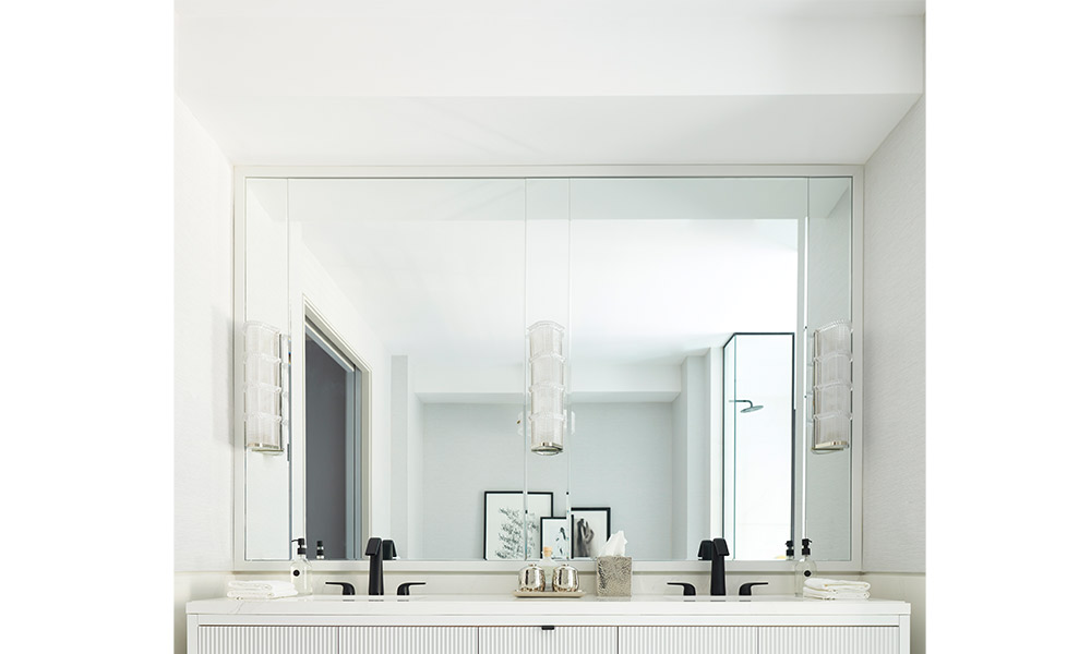
When it comes to a mirror in the bathroom, the bigger the better. To maximize the space over the dual vanity, five panels fit together to create a wall-to-wall mirror. Brian centred two larger sections over the sinks. Three smaller pieces frame the sconces. Each pane of glass was cut with a bevelled edge to help mask the seams. And then Brian trimmed the entire mirror with a frame to match the vanity.
Photography courtesy of Nourish Marketing(1-3), Angus Fergusson (4-6)