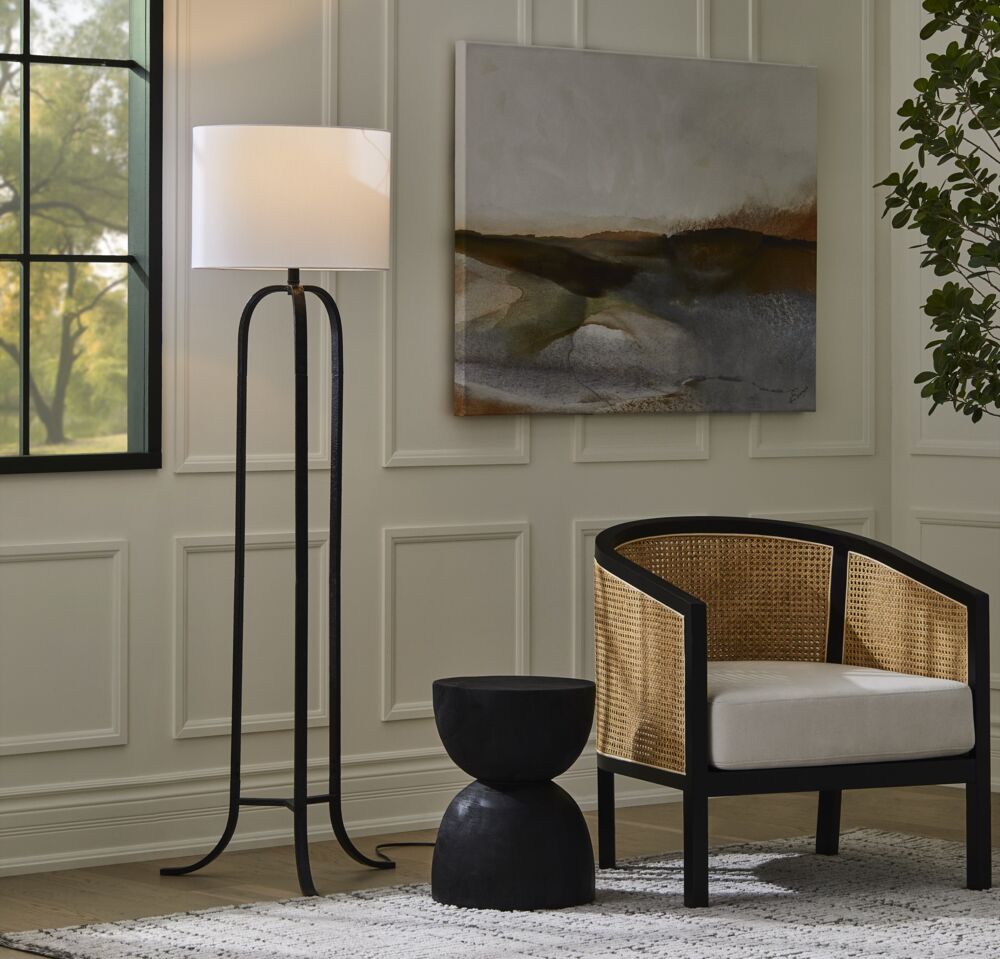
Good lighting can make a room feel warm, considered, and completely pulled together. Bad lighting — even in a beautifully designed space — can make everything fall flat. The frustrating part? Most common lighting mistakes are easy to fix once you know what to look for. Here are five worth addressing in your home.
1. Not Layering Your Lighting
Relying on a single overhead fixture is one of the most widespread lighting mistakes people make, and it’s also one of the easiest to fix. A room lit by one source tends to feel flat and a little harsh — there’s no depth, no warmth, nowhere for the eye to settle.
The solution is layering: combining overhead lighting with task lighting (for reading, cooking, or working) and accent lighting (for artwork, architectural details, or a cozy corner). In a bathroom, for example, overhead lighting alone casts unflattering shadows on your face. Add wall sconces on either side of the mirror and the difference is immediate.
Think of lighting the way you’d think about furniture — no single piece does everything, and the room is better when the elements work together.
2. Getting the Scale Wrong
A fixture that’s too small disappears. One that’s too large takes over. Scale is everything, and it’s worth measuring before you shop rather than eyeballing it in the store.
Start with the room’s dimensions: add together the length and width in feet, and use that number in inches as a rough guide for your fixture’s diameter. A 12-by-14-foot room, for example, suits a fixture around 26 inches wide. For ceiling height, taller rooms can carry larger, more dramatic pieces — lower ceilings call for something more compact.
Brian’s Tip: Before committing to a fixture, try mocking up the size with paper cut to scale. It sounds low-tech, but it works.
3. Thinking Everything Has to Match
Your light fixtures don’t need to match everything else in the room — and in fact, they often look better when they don’t. Think of lighting as a decorative accent rather than a finish that needs to coordinate.
Mixing metals and finishes can add a layer of visual interest that a perfectly matched room sometimes lacks. If your kitchen hardware is nickel, a brass pendant over the island creates a beautiful contrast. If committing to mixed metals feels like a stretch, start smaller: combine polished and brushed versions of the same metal — say, polished nickel hardware with a brushed nickel fixture — for a subtler variation that still adds depth.
4. Placing Fixtures in teh Wrong Position
Even the right fixture in the wrong position can throw off an entire room. Height is the most common issue. A pendant hung too high above a dining table loses its intimacy; too low and it blocks the view across the table. A good guideline is 32 to 36 inches between the bottom of the fixture and the tabletop — enough to illuminate the surface without getting in the way of conversation.
Wall sconces work best mounted around 66 inches from the floor. For table and floor lamps, sit down first. Measure from the floor or tabletop to your eye level when seated, and aim for the bottom of the shade to land at or just below that point. It prevents glare and puts the light exactly where it’s most useful.
5. Using the Wrong Bulb Colour Temperature
You can have the perfect fixture in the perfect position and still get the lighting wrong if the bulb colour is off. Bulb temperature is measured in Kelvins (K), and it has a significant effect on how a room feels.
For living spaces, stick to warm white bulbs in the 2700K to 3000K range. They cast a soft, inviting glow that makes rooms feel comfortable and relaxed. Bulbs above 3000K shift toward a cooler, brighter white that’s better suited to commercial or work environments — and can make a home feel clinical rather than welcoming.
When in doubt, go warmer. It’s a small change that makes a noticeable difference.
Lighting shapes how a room feels more than most people realize. Addressing even one or two of these lighting mistakes can shift the whole atmosphere of a space — and the fixes are usually simpler than expected.
Photography by A Plus Creative